Note – This blog is completely my opinion and not against a person or tool
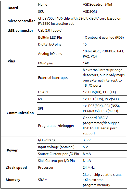
I received this call last night one of our mentors at VSD, who knew I was doing some benchmarking of all opensource EDA tools against “——–” and asked me to drop a blog on this.
Let me quote something here – “Opensource is not just a set of tools, it’s an attitude shift”. It’s like an out-of-the-box thinking, which once adopted, can be applied to any closed- or opensource- tools. And that itself is a billion-dollar market. How? Think of start-ups. Most of them (including ours) started on a piece of paper, which is freely available (opensource?)
In our free time, I explore a lot of opensource tools for our own vsdflow to see what fits. Infact, we have almost tried every tool for RTL2GDS, many of which are a part of vsdflow. They seem to work fine for small designs, up-to 50k instance count. There are other opensource tools released by theopenroadproject.org supported by DARPA and I have tried them independently, outside the flow. They work fine for upto a million-instance count
But hey – Here’s the thing – When we say, “something works fine”, what is “fine”? Is it tested on a design which is already taped out? Is it “bench-marked” against an industry grade EDA tool which already works fine? If it is “bench-marked”, by what percentage does it correlate with that tool? Thankfully, my guide at IIT Bombay, my managers and mentors at VSD always did talk from a customer or user point of view, which makes always think about “what does ‘works fine’ mean in real world”
So, I took up two STA tools, OpenSTA from openroad project and “——-” from “——-“, to explain, to some extent, what “bench-marking” means to me. I would also encourage everyone reading this blog to come up with their definitions of “bench-marks” for other tools and we can model that. You can fill-up “——” with one of your favorite industry grade EDA tools. The concept of benchmark won’t change
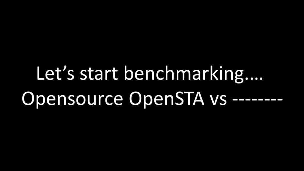
Now look at below 2 clock periods
Ideally, expectation is “a timing path” from launch clock to capture clock, should have exact same “slack” in OpenSTA and “——“. That is next to impossible as two different tools use different precision algorithms to model delay. Logic might be same, but algorithms vary. Think of this of having a “cheeseburger” from “shop A” and “shop B”. They might look the same but will taste different.
Our job is to find out, by what “percentage” does “shop A” burger taste correlates with “shop B” burger. Similarly, we are trying to find out, by what percentage does “OpenSTA slack” correlated with “—– slack”. To do that, we need a reference. I took that reference as “clock period” and I set up a personal goal for OpenSTA, which is – OpenSTA slack should be within ±1% – ±1.5% of “Clock period”.
Many would agree to this, because 1% of clock with period 1ns is 10ps. Looks fair for sub-nm nodes
But many would also disagree to this, because, 1% of clock with period 10ns is 100ps. Looks unfair for same sub-nm nodes
Now that’s a matter of negotiation and highly design/foundry dependent. In that case, we have to segregate our analysis, saying for same design/foundry, for portions of chip running at 1GHz (or 1ns clock period), we will have a criterion of ±1%. But for portions of chip, running at 100MHz (or 10ns clock period), let’s go for ±0.1% of clock period. And so on. There can be many such combinations
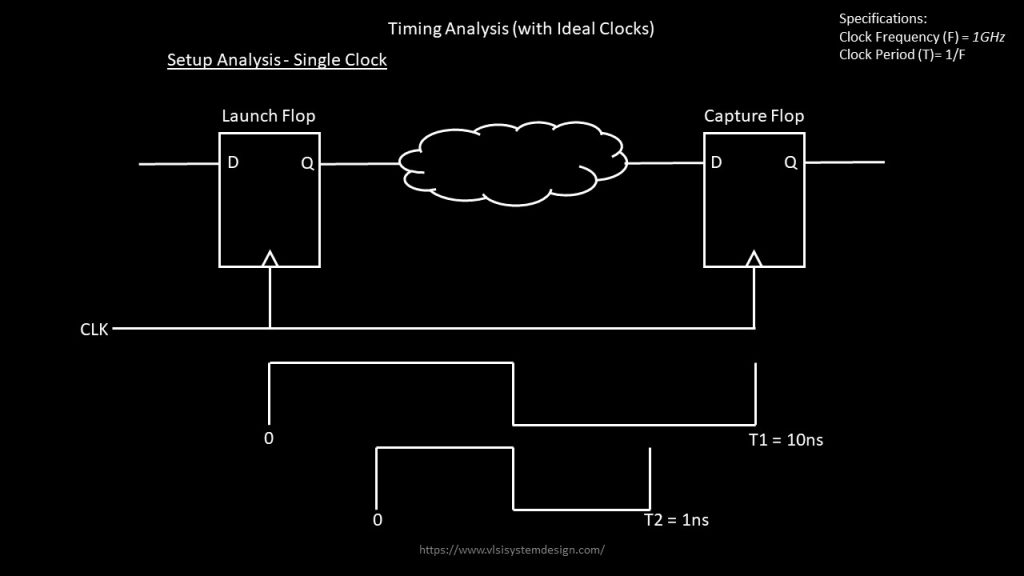
For my experiments, I used ±1% for clock period of 100MHz i.e ±100ps of 10ns clock period. Next, dump out top 10k worst slack endpoints. They can be +ve slack or -ve slack. Since it’s a taped-out design, very likely you will get a design with +ve slack. Compare OpenSTA 10k worst slack endpoints with “——-” worst slack endpoints, for both setup/hold and generate below graphs. Use excel sheet or any Unix scripts to generate below histograms
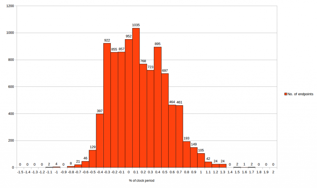
The first graph is for setup and second graph is for hold
From first graph, we can say, OpenSTA setup time correlates within -3% to +1% of clock period with “——–” STA tool. Which means maximum (setup) slack deviation between two tools is -300ps to 100ps
From second graph, we can say OpenSTA hold time correlates within -1.1% to 1.7% of clock period with “——-” STA tool. Which means minimum (hold) slack deviation between tools is -110ps to +170ps
NOTE – Generally for hold slack, the criteria is stricter compared to setup
Looks quite simply done (QSD)– Isn’t it?
No, it’s not. If it had been simple, anyone would had done this.
The big question is “WHY” do we even see -3% or +1% or -1.1% or +1.7%? That’s where analysis experts come into picture. Remember, from one of my STA – Part 1or STA – Part 2 courses, that “slack” is made up of launch clock delay, capture clock delay, skew, data arrival time, library setup/hold time, CPPR, individual net and cell delay, clock uncertainty
Now build similar histograms for all the components of “slack”, then analyze, where is the deviation coming from, try modelling that deviation in OpenSTA tool and re-run the entire experiment again to identify, how much has it improved. That’s what will complete the benchmark for top 10k paths
Does this also look QSD (quite simply done)?
No, it’s not. The next level – how does OpenSTA behaves compared to “——-” when modelling OCV, AOCV, SOCV. Another level (or a check) is the netlist and extracted spefs should be from same extraction engine. Everything should be same, expect the timing tool. That would complete the benchmarking
Now, does it still look QSD (quite simply done)?
Wait – I haven’t even started talking about extraction correlation, DRC correlation, LVS correlation, SI correlation …. and I have a huge list which exactly tells you what it would take to qualify
Final note- All above graphs is from pre-layout netlist. What about correlation on post-layout netlist? Stay tuned for my upcoming blogs